Schnellzugriff
- What is a digital storefront?
- Squeeze pages
- Sales pages
- Lead capture pages
- Retargeting landing pages
- Conclusion
Most people don’t go out shopping just to shop. They typically have a product in mind with intent to buy. So when faced with an empty store with no signs in the windows, or a well-designed store with a huge sale sign in the window for the exact product they’re looking for–they’re most likely to enter the latter.
First impressions are everything, even in the digital era where sales are transitioning online. Yet, while every customer is unique and requires different offers and engagement, it’s unrealistic to expect brands to create entire websites for every user.
They can, however, create unique digital storefronts for each one.
In the digital world, your landing page serves as your storefront–your main avenue to making a great first impression, and a vital contact point for a customer, setting the tone for the entire relationship and transaction.
For example, online shoppers often search Google by keywords to find the specific product or service they’re looking for. Searching for exact terms indicates high intent, which helps brands target interested buyers.
The problem: a brand could have the perfect product or service to meet that consumer’s needs, but if it’s not advertised properly, a good relationship won’t form and a transaction will never happen.
Using post-click landing pages as your online storefront offers an opportunity to provide a unique value proposition to highly segmented personas in a professional and credible way. It allows you to present your brand as an authoritative, relevant, and trustworthy source within your industry.
Remember, though, a digital storefront is a direct representation of your business–for better or worse. If your landing page is cluttered, unorganized, and unprofessional, the visitor will likely bounce immediately. If it’s conversion-optimized, you’re more likely to capture their attention and convince them to convert.
It’s important to take a look at your electronic storefront to see what it says about your business. As inspiration, here are four ways brands use various landing pages to attract consumers’ attention, entice them to engage with the page, and pursue the offer.
4 Ways to use landing pages as your digital storefront
Squeeze pages
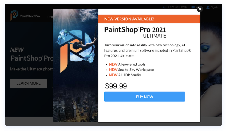
Squeeze pages provide good reason and an irresistible offer to visitors in exchange for their information. Here’s one that PaintShop Pro uses to capture visitors’ attention and show them why they should purchase before they leave the website:

- “New version available” let’s visitors know they don’t currently have the best/newest option and entices them to upgrade.
- Bulleted lists and bold copy provide important information in an organized, easily-digestible way.
Only one offer keeps visitors focused and on track toward conversion. - No exit links makes it less likely that visitors will bounce, and more likely they’ll redeem the offer.
- The blue CTA button contrasts well with the orange, black, and white page.
- A click-through format makes the form non-intimidating for prospects to complete on the next page.
Sales pages
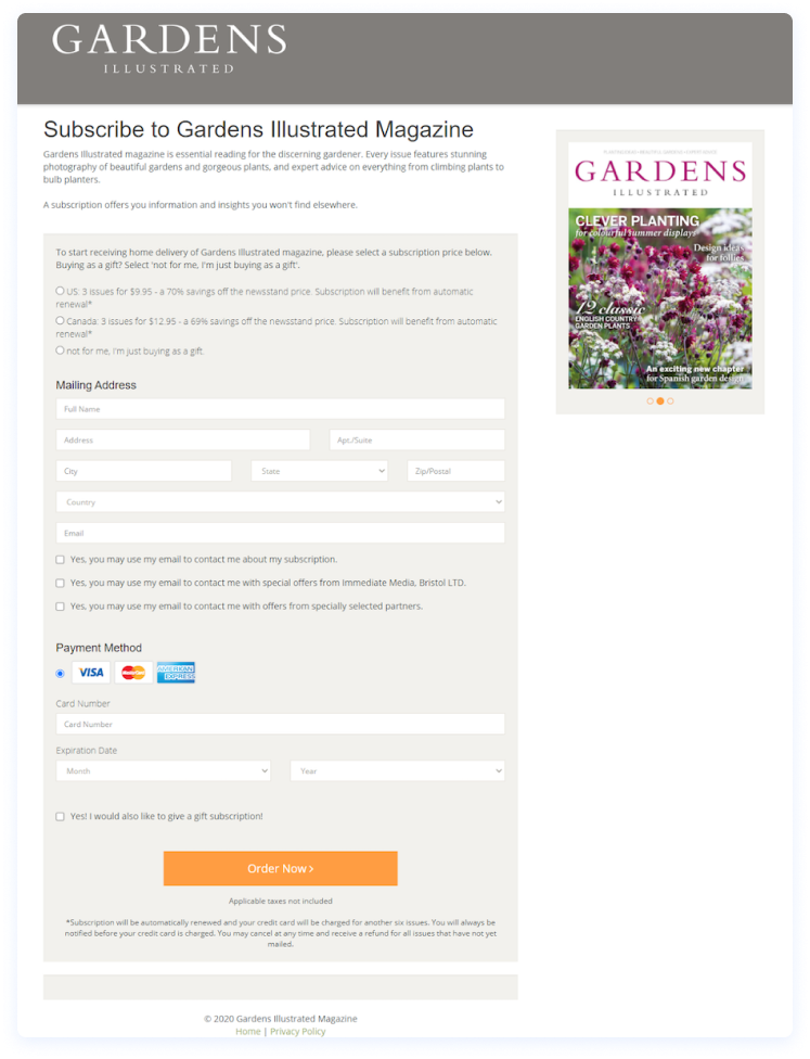
Squeeze pages provide good reason and an irresistible offer to visitors in exchange for their information. Here’s one that PaintShop Pro uses to capture visitors’ attention and show them why they should purchase before they leave the website:


Kommentare